As a lot of you will be aware of by now, since late November, there has been significant disruption to international shipping leaving the UK. I wrote a post at the end of last year explaining the cause of the delays and what we were doing to keep everyone informed.
Please read the original post HERE
Since then, the majority of delayed orders have been delivered. However, the disruption has continued due to several events. Below is a brief timeline of what we know has happened so far.
23 November
Royal Mail strike action began to disrupt the postal system across the UK. We were advised by their business team when to despatch orders and they assured us that there were contingency plans in place to handle the increased mail being sent out ahead of Christmas.
26 November
ORDERS #26969 – #27577
A large batch of orders were collected from us by Royal Mail. Although all orders were picked up, Royal Mail's tracking system continued to say that they were still with us. Their tracking system started to fail around this time, with no updates being posted.
As of January 21, all of these have now been delivered, with the exception of two orders.
29 November
ORDERS #27578 – #27904
Another large batch of orders was picked up from us. Again, this batch was severely impacted in the same way.
As of January 21, most of these have now been delivered, with the exception of a handful of orders.
1 December
ORDERS #27905 – #28217
One more large batch of orders was sent out and at this point we were still unaware of the scale of the disruption at Royal Mail.
As of January 21, most of these have now been delivered. There are still around 80 orders that have not been, although a third of those are now in the destination company ready for delivery.
4 December until 8 January
We closed our website and continued to monitor what was happening with outstanding orders. During this time orders from November began to move and we continued to send very small batches. These smaller batches suffered no delays. Customers were still able to order throughout this time, if they were OK with getting their order shipped during first week of January.
9 January
Royal Mail seemed to be clearing their backlog and orders from November and early December were moving.
We posted a large batch that included all outstanding orders from December 4 onwards. Things seemed like they were returning to normal.
11 January | CYBER ATTACK
Just as everything was returning to normal. Royal Mail completely froze all international shipping and we received a bulletin that there had been a major cyber incident and that we were not to ship anything outside the UK.
12 January – 20 January
All international mail remained where it was and we were unable to ship anything. We posted a warning on our website that if you are from outside the UK you should not place an order at this time. The backlog from December was frozen and items that seemed to be on the move came to a stop.
Royal Mail were very guarded about the situation and gave us few updates, other than repeated warnings the all international mail was suspended.
20 January – 21 January
Orders from the 1 December and 9 January batches have begun to move and we have been told that we should be able to post International mail very soon, after they have cleared the backlog.
WHAT ARE LA MORT DOING TO HELP?
As I mentioned in my last post, it's been incredible how understanding and supportive you've all been throughout this and we're trying our best to repay that by being open and communicative about the situation. We don't want to leave anyone feeling like we let them down.
We've segmented all of your email addresses by when your items were sent and what the current status of your order is, so that the guidance we send you is relevant to you.
We have completely paused all advertising for now, so that we can prioritise looking after all of you, and resolving things in a way in which you are all satisfied.
We are checking all tracking updates daily on outstanding orders and the email you should have received details when and how to get a refund on your order. Every customer of La Mort will either end up with their clothing, or their money back.
I will update this post with further information over the coming weeks. Thanks again for bearing with us.
David and the La Mort team.
UPDATES
25 January
A lot of orders seems to have moved over the past two days. The 1 December batch is mostly delivered, or in the destination country, which is very good news. There are still a few orders that are struck in the UK, but I'd expect these to move within the next few days.
The 9 January batch is looking better too. There are still a lot of orders stuck in the UK, but a good number of orders have left the country of been delivered.
]]>If you’re reading this, it’s more than likely that you’re aware of some shipping delays going on at the moment. You may not have received your order, or you may be wondering why your tracking information is not updating.
We’ve put together this information to answer a few questions you may have and to reassure you that we are fully aware of what’s happening and that we will ensure that none of you are left disappointed with your La Mort experience.
WHAT’S HAPPENING?
Members of Royal Mail, the UK’s national postal service, have been carrying out strike action throughout November and are continuing into December. The strikes were scheduled well in advance so that UK businesses could work round them and, until the lead up to Black Friday, we had no real problems.
Unfortunately, after the 20th November it seems the influx of post being sent in the UK completely overwhelmed Royal Mail, and they stopped processing parcels for a few days. Royal Mail’s advice to small businesses like ours was that the disruption wasn’t severe and as long as we allowed a couple of extra days then things would be OK.
That has not been the case. Some of our orders are getting through, and some are delayed. The good news is that once orders are arriving in their destination country, they seem to be getting delivered quickly.
WHICH ORDERS ARE AFFECTED?
We get our mail collected in batches every couple of days. Certain batches seem to be affected more than others. Here’s what we know so far:
- As far as we can tell, order numbers #27033 (placed on November 16th) and earlier are either in the destination country being processed, or have already been delivered.
- Some orders seem to be stuck somewhere for 10/14 days and then suddenly move.
- International orders are affected more severely that UK orders.
- Orders are starting to move at random, not sequentially, so if you ordered at the end of November, you may get your package before someone that ordered a week earlier.
- International orders collected from us on Saturday 26 November (#27203 – #27577) are particularly badly affected by these delays.
MY TRACKING LINK SAYS MY ORDER HASN’T BEEN SENT YET
All orders placed before December 1st (when we closed) have already been collected by Royal Mail. Some orders collected nearly two weeks ago are still showing as ‘We’re expecting it’. Usually, this status means that we are waiting for mail to be collected from us.
What this now seems to indicate is that Royal Mail have stored our packages somewhere at one of their depots and have not yet scanned them onto their system to begin processing.
All orders are now with Royal Mail and not with us.
WHY IS MY TRACKING INFORMATION NOT UPDATING?
As well as parcels not being processed for long periods of time, the tracking updates from Royal Mail seem to be very patchy with little in the way of actual information, until suddenly they’ll appear in the destination country or get delivered. We understand that this is very frustrating.
All our items, once in the destination country, will be delivered by your own country’s postal service. If you paste the tracking number we emailed you into their website, quite often you’ll find extra information.
For example, if your order is being delivered to Germany, use the tracking number we sent you on the Deutsche Post website to see if there are any additional updates.
HOW LONG WILL I BE WAITING?
Unfortunately, we can’t estimate how long you’ll be waiting for your order. We’ve contacted Royal Mail business support numerous times, as well as checking how other small UK businesses have been affected to see if we can get any more information. What we do know is that the disruption has been massive.
From what we’ve seen, it’s likely that your order will randomly update over the next two weeks and then arrive.
Royal Mail’s official position is that all mail collected before the 8th December (our last collection was a few packages on the 6th December) will arrive before Christmas. Although that is still a possibility, it’s now not as certain as it would usually be.
WHAT WILL LA MORT DO TO RESOLVE THIS?
We’re a very small team here at La Mort, and we always focus as much on customer service as we do on our artwork and products. We’re extremely disappointed that this is out of our control and that we have to sit by and watch it unfold, without being able to help more.
As a precaution, we sent all international mail fully tracked from the 26th November onwards and although this doesn’t speed things up, it does let us see what is happening and get a much better idea of the broader situation.
We are still confident that most orders will arrive before Christmas, but it’s a reality that some may not. We will be closely monitoring all tracking information between now and then and posting updates if we have any.
If your order has not arrived by January 5th contact us by email at [email protected] and let us know
If any orders end up being lost/returned to us, we will not leave any of you without replacements being sent out or refunds being issued.
We’ve been in contact with a lot of you already and we’ve been blown away by how understanding you’ve all been.
We really appreciate your patience while this gets fixed.
David and the La Mort team.
ADDITIONAL UPDATES:
9 December | Some of the international parcels from the Saturday 26 November batch (orders #27203 – #27577) are finally on the move and are now showing as 'In Transit'.
10 December | Nearly all of the international parcels from the Monday 28 November batch (orders #27578 – #27904) have been delivered.
]]>
At La Mort, it’s been on our minds that continuing our business might not be the right thing to do with the circumstances escalating as they have been. We have been discussing it each day for the past week or so and, as the owner of our family-run brand, I have ultimately come to a decision that, for now, the health and wellbeing of our customers, everyone that makes and sends our orders, and my family must come first. Sadly, that means we will be putting things on hold for a while, as we wait this out.
Our checkout pages have been disabled for the time being. All outstanding orders will be sent out this week, and all of our customers who pre-ordered items will be receiving an email within the next day or so with more information about our stock situation and what happens next. We won’t let anyone down and we won’t stop working until all loose ends are tied up. Although we won’t be taking orders over the next few weeks, or possibly months, we will be checking our emails as always throughout that time and can always be reached on Facebook messenger.
With the bad news out of the way, I want to give you all something to look forward to. During this period of uncertainty I’ll be devoting all of my time to creating new imagery and working on new product ideas, so that when we return it will be a time of excitement for everyone. Until that day, please look after yourselves and everyone around you and keep yourselves safe.
You’ll be hearing from us again before you know it.
Below are the answers to some of the questions you may have at this time.
Will I still get my pre-ordered shirt?
Unfortunately, due to the UK lock-down, the factory that prints our clothing has also had to shut temporarily. The order we placed with them is now on hold, which means that we won't be receiving new stock for several weeks or even months. If you pre-ordered an item from us, you will have received an email explaining the situation. If you can't find it, please check your junk folder.
You can also send an email to [email protected] with the subject line 'REFUND' (followed by your order number) for an immediate refund on all pre-ordered items, or 'I'LL WAIT' (followed by your order number), if you are happy to wait and receive your item when we have it. As mentioned, this could be several months. If you choose to wait, you'll also be given a 20% discount on your next order as a thank you from us.
Can I still return or exchange items that I have bought?
We are aware that there are now severe restrictions of movement in a lot of countries including our own. With this in mind, we have extended our returns deadline from 14 days to 90 days, to give you time to send your items back, should you need to. So, if you can't get to a post office soon, don't panic, there is no rush. We cannot exchange any items at the moment, so if you chose to return an item to us, you will be refunded, instead of being offered a replacement.
Can you send me an email when you re-open?
Yes we can! If it's your first time visiting us, join the Cult of La Mort mailing list below, and we'll send you an email as soon as we re-open. We'll also have some gloriously macabre new products available to mark the occasion.
“I am transported to wonderland. I walk in streets where gold is dirt, and I have no desire to gather it. I wonder whether it is worth while to explore the canals of Mars, or rock myself on the rings of Saturn, but before I can decide, a thousand other fancies enter my excited brain.”
An Essay on Hasheesh – Victor Robinson (1912)

Threshold
Damp Earth and Golden Spires
It’s October 7 and our new collection, which is the culmination of 10 months of hard work, has just been released. There is so much planning and preparation with each new illustration I create, that working on an interlinking and visually cohesive series, can become an all-consuming task. Now it’s done, I can finally breathe out.
The concept behind Strange New Heavens came from the ashes of Revelations, our last collection, and in some ways, it’s a natural follow-up. Where Revelations studied the ideas behind epiphany and the Earthly struggles between birth and death, Strange New Heavens looks upwards and explores the ritual use of intoxicants to unlock new layers of consciousness and mystical other worlds.
This series takes its cue from those artists, poets and shamans that, throughout history, have used powerful, now-forbidden drugs to ascend the staircase to the stars.
The Concept
“Daucas-Carota was seated astride the clock, and made appalling grimaces at me.
The hands did not move.
‘Wretch! You have stopped the pendulum,’ I cried, drunk with rage. ‘Not at all–it’s going back and forth as usual, but suns will crumble into dust before this steel arrow has advanced a millionth of a millimetre.’”
Le Club des Hachichins – Pierre Jules Théophile Gautier (1846)
I have always been fascinated by the many artistic and literary references which exist, that detail the experience of using drugs to gain access to new realms of thought. The idea of taking a forbidden shortcut to enlightenment is, in itself, intoxicating. There is no shortage of places to look in order to find lurid descriptions of chemical transcendence, and the downfall that invariably follows, but I wanted to describe a more mystic event.

Engravings from alchemical/emblem books.
Like the engraved prints in early alchemical and emblem books, I intended to create a series of illustrations that would describe the very process of absolute intoxication. This was the starting point of what would become Strange New Heavens.
Setting out The Journey
The initial stage of design involved dividing the whole experience into pieces, and assigning each piece its own written description, much like choosing which pages of a book to illustrate. At first, I decided on seven levels of transcendence, but soon felt that this left too many gaps in the process. I then settled on 14 levels and split them across two collections (a clue as to what you can expect in 2019!), with the mid-point being the threshold between this world and the journey to enlightenment. The point at which reality ceases to exist.
The images in this collection do not represent the effects of a specific drug, but roll into one all the experiences I have looked into regarding the ritual and historical use of opium, hashish, as well as many types of hallucinogens and dissociatives.
The Seven Levels of Intoxication – Parallels with Alchemy
Symbolism is the art of changing or shrouding the meaning of a message by representing it in another less obvious, or completely unrelated way. This was an extremely useful tool used by alchemists, who wanted the chemical processes they were working on in secret to be understood only by a chosen few.
Their complicated diagrams and maps could only be followed when viewed in the right order, and by those people who already knew the codes and symbols used. The green lion, the old dying king, the white queen and various pieces of apparatus, which appear in many alchemical prints, were all used to symbolism different processes and reactions. Different alchemists used the same symbols to mean different things, or different symbols to mean the same thing, hoping to obscure their secret work.

The Unseeing, The Thief, The Conspirer and The Ritual. The first four parts of Strange New Heavens.
This way of thinking has had a profound effect on my own art, and I now find myself interlocking different sets of symbols and settings to explore my own secret world.
The pomegranate, the flaming sun ray, the hand and dagger, the burning castle, and countless other icons, fit together in this new series, and describe a story and a process which can’t be fully described with words.
The stages of the transformation are as follows:
- Unseeing: Blindness and chaos with no awareness of any higher realm. A cold and logical place.
- The Thief: An awareness of something other than the present. The idea that the key to the next stage is forbidden and must be taken without consent.
- The Conspirer: With the key in hand, the first thoughts of what it means to leave this Earth and head for the uncertainty of the unknown.
- The Ritual: Taking the raw materials and, following careful instruction, forging them into something useful and powerful.
- The Initiated: The poison has been consumed and the point of no return has arrived. A feeling of intense, overwhelming trepidation.
- The Poison Takes Effect: The first effects begin to creep though the veins. The eyelids grow heavy and something unknown begins to take control.
- The Threshold: As this world falls away, a doorway appears and there is no choice but to enter. The light becomes blinding and the way forward presents itself.
This is the first part of the journey. The rest will follow.
The Technique
As with previous collections, I first finished several designs in pencil before moving onto inking. With each new series of illustrations, I find myself wanting to include more information and more complex narratives and this has resulted in the use of much smaller pens, and a return to stippling with dots to render more subtle areas of tone.

After each pencil drawing is constructed and finalised, it is flattened in Photoshop and printed out at 8% cyan on 250gsm Bristol board. At this point I am sitting in front of an extremely pale blue print out of the design, which is dark enough that I can see where to ink, but light enough that, once finished, the pale blue guide artwork can be easily removed in Photoshop without effecting the inked layer.
I ink all of my pieces with Staedler pigment liners (sizes 0.1 and 0.05) and Faber Castell PITT pens (sizes S and F) and occasionally I’ll use a brush to fill in large areas.
Once the black layer is complete, I work over the whole image again adding white highlights. These are worked on using a variety of techniques, including scraper board layers and using a pen on tracing paper, which is then inverted in Photoshop and dropped over the original artwork.

The Poison Takes Effect
Into the Sun and What Comes Next
Far from being a complete series, I feel that Strange New Heavens has just started. I have so much more to add to this project and just as the iconography of death became the focus of many year’s work, this new direction promises so much.
Rather than looking down into the earth I want to look upwards into impossible architecture, blazing sun rays and the infinity of the heavens. Who knows where this will end? Maybe it won’t.
]]>

The Illustration
Unrequited was the fifth piece I created for the Revelations collection, and at the time I was looking for, and not seeing, any small starting point on which to base the image. Unrequited love is a very emotive subject, and I wanted to choose a central image that would be bold and threatening.
After much searching, the answer eventually came in the form of a quote from a book called The Book of Unholy Mischief by Elle Newmark.
“...unrequited love does not die; it's only beaten down to a secret place where it hides, curled and wounded. For some unfortunates, it turns bitter and mean, and those who come after pay the price for the hurt done by the one who came before.”
This conjured up visions of black sea monsters and stricken ships, like those written about by H. P. Lovecraft. The octopus was based on a number of vintage engravings featuring giant beasts dragging sailors down into the deep, and the illustration was completed by the addition of a large Portuguese galleon about to meet a similar fate.


The Print
The print is part of a limited edition of 25, and each one comes signed a numbered. I chose Platinum Etching 285, a beautiful soft-white, heavy fine art paper, for this print run as the soft tone and the slight texture look beautiful with the heavy black areas of the design.
There will be several further prints released that have been designed to sit next to this one.
Prints go on sale at 12pm GMT on Saturday 31 March. If you would like to own one, click the link below.
UPDATE: All prints have now sold out.
]]>Well, this year I decided to switch it up in the studio and start things in January, and with our Revelations collection being our most popular yet, I really wanted to step things up again. It’s never good to stay still too long.
A Visual Album
I’ve approached this series like it’s an album. You know when you hear a collection of songs that just fit together perfectly? When you feel like you are unlocking something unknown. That is a feeing that I want carried across in this set of illustrations.
I have spent the past couple of months working on the theme and breaking the story down into parts. To begin with there is a tangle of ideas that need to be pulled apart, put in order and approached separately. This has to be done before the drawing starts. There were many weeks of scouring through reference images and scribbling in notebooks before I started work on the first piece.

Black Smoke and Golden Stars
As I write this post, the first few pencil drawings are complete and the piece above was the second to be finished. There is a strong Eastern flavour, with elements of Byzantine iconography, as well as a psychedelic touch. I’m starting to explore new directions, outside the typical ‘death art’ scene.
This will be the first series I have worked on that will feature multi-coloured designs. Each pencil drawing will be inked by hand to form the black layer, with most of the main detail and shading. After that, the new inked artwork is pinned under tracing paper and all the areas that will print gold are inked. This is repeated for each colour. It’s a time-consuming process but it gives that warm, hand-drawn feel that I’m always looking for.
Hidden iconography
This series also includes another first. There will be a hidden visual language that runs through the whole collection. Little messages and clues which relate to each other and tell a secret story of their own. When each piece is released, you’ll be able to put them side-by-side and try to decode what is actually happening.
Release Date
The collection will be released around the beginning of September, and as well as our clothing range, there will be some large limited-edition, hand-printed posters available.

Most of the time, I hate what I do.
Not the end product, or even the rising excitement that comes before I start work on something new. Just the way it never goes as it should. Spending hours, days and weeks drawing tiny dots and lines, one next to the other, with no idea if the vision that was in my head will translate to the finished piece. It is a long and torturous process.
Finding ideas is worse! Each one seems to drift like vapour out of a locked vault in my head. When I am really in need of a graphic starting point, and am looking for that spark to get things moving forward, ideas either never arrive, or are so fleeting that I can barely pull them down onto paper.
Revelations was different. The ideas came so fast that I barely had time to make scribbled notes.
For a while, I’d been wanting to explore the subject of epiphanies and how much of a lasting effect they can have. The first time you act on feelings of lust, or read about the infinity of space, are moments that shape you and stay with you. These are milestones in human development and, because of the unexpected and powerful way in which they appear, they are something that fascinates me as an artist.
Bringing it back to earth
Revelations, the title I chose for what would become the new collection, was dreamed up before I had even thought about any individual designs. The word alone seemed to ignite so many possibilities and, with the obvious Biblical reference (although there would be no direct religious iconography depicted), it carries weight and an otherworldly, haunting familiarity. This was to be the first collection that truly centred around a single word.
I decided that each of the seven or eight pieces that would make up the series, would be based inside a frame that would give the whole collection a stained glass window style, similar to the image below.

Even more importantly, each piece would lock together with the next, making a set of drawings that, when viewed in a certain order, would make up a larger design. I’d not done anything like this before, so didn’t really have a clear starting point, but I was feeling good about things at this point. I may have given up, had I known what was to come.
Setting the ideas alight
It was my girlfriend, Lucy, who sat with me and drafted the first group of ideas, and her input helped steer the project and push it forward quicker than I could have done it alone. I have spent years drawing death and everything to do with it, so I was looking forward to adding something new to this. Maybe I could research other areas of art that I had not explored before. Maybe I could look back at what started my love affair with graphic poster art and throw some of that fuel back on the fire. I wanted this collection to burn hot with detail and concepts.
Below are the notes we both made during that first conversation. The ideas would later transform into the final concepts.
- Science: Arts | Intellect | Knowledge
- Morality: Heaven and Hell | Justice | Scales | Ethics
- Manipulation: Bending things to your will
- Unrequited Love: Despair | Suicide | Madness
- Hunger: Gratification | Feasts | Fruits | Adam and Eve
- Lust: Perversion
- Mortality: Death | Tombs | Gardens
- Space: Infinity | Our place in the Universe | Planets (Astrology and Astronomy)
Interlocking icons
From the outset, this collection seemed to be pulling in a different direction from usual. I had a framework for each piece in mind, but needed the whole set of designs to work as one, when placed side by side. This would mean bleeding certain, carefully chosen elements from one piece to the next. The sunlight that illuminated the whole sky of Lust, would then flow into Death and disappear behind the mounted knight. The intricate plates of coral, which would rise up beneath the galleon in Unrequited, would then shift across and appear at the bottom of Morality.

As well as this jigsaw puzzle of symbols and icons, I wanted to work an almost psychedelic, or art nouveau element into certain designs, to break up the rectangular borders. Soon, the whole thing became a kind of graphic riddle, with constant shifting and changing to make sure everything flowed as it should.
Haunting Hallucinations
By now, Revelations seemed to be taking on a life of its own. The more I tried to calculate the right approach, the more I got lost amongst the layers of smoke, the decaying skulls and the silent landscapes. There seemed no right place to start drawing . As always, I prepared no sketches first, and moved straight into the final pencil artwork. This is by no means an easy route, but I’ve found it to be the only way in which I can get the immediacy of my ideas across. If i sketch an idea, more often than not, I lose interest in it.
I spent hours sifting through reference images, pulling things out, and trying to change and add to the imagery that I often use. Skeletal, Egyptian-style dancing women, wooden warships and underwater seascapes sat beside my more familiar icons, like skulls, ribbons of smoke and flowers.
This was fast becoming a demanding, and all-consuming graphic project and as it progressed it became more and more difficult. I felt excited and overwhelmed. Pushing forward and racing ahead to try and bring all this under control. As you’ll read in part two, this turned out to be an extremely productive place to be.
]]>This September there has been an extra treat for us to get excited about. In late 2015 I was asked by The Book of Skulls author, Faye Dowling, to be involved with her new book, The Book of Black. At first I was asked to submit work for the inner pages, but later in the process, I was given the opportunity to submit a design for the front cover.

After many months of hard work by Faye and the publishing team, The Book of Black has now hit the shelves and we have a limited number of copies for sale in the La Mort store. First, take a look at what's inside!
The book is split in to three parts: Gods & Monsters, The Kingdom of Darkness, and Dark Arts/Higher Powers. Each part showcases a different area of occult graphic art, a works include painting, drawing, photography and sculpture. Each page is beautifully laid out, with crisp graphics on lovely uncoated paper. As well as being full of interesting examples of previously unpublished work, it's a lovely book to hold in your hands. Below are some examples of what you can expect.


Much like her previous work, Faye has created a book that is a must-have for anyone interested in the occult graphic arts, and I'd like to thank her for inviting me to be involved.
I won't give any more away about what's inside, as I hope you'll all have the opportunity to pick yourselves up a copy. I have signed a limited number of books and listed them in out store, so click below to get yours.
Click here to buy The Book of Black!
]]>

That is, until I stumbled upon the page of Stonerror. What in the fuck is this? Finally a band doing desert rock for real. Grinding overdriven guitars and oily basslines rolling over the most hypnotic drums since the QOTSA debut album. No pointless jamming, and everything unnecessary stripped out. By the time I contacted the band and asked to use their music, I had been listening to The Wolf, a track from their first album, on repeat. It has the most infectious groove. As well as absolutely killing it in the studio, they turned out to be a modest, down to earth and friendly group.
Read this interview and you'll understand why I am trying to spread the word about this wicked group.
Enjoy...
With the stoner/desert rock sound starting out in America, it's great to see that it’s going strong in your home country of Poland. What is the rock music scene like in Kraków?
There are many stoner/desert and doom bands in Poland now. Some of them are really good and also doing well abroad. We also have a couple of growing stoner/doom festivals (like Soulstone Gathering or Red Smoke Festival) with international headliners. So yeah, things are happening. In Kraków, there are also some bands in the genre, but the local underground rock scene covers a much wider spectrum – from punk rock, to alternative rock, hard rock, and all kinds of metal. For us, as Stonerror, it is important not to remain within a particular, constricted circle or genre. We like to play with different bands, so our music can reach new audiences, who wouldn’t otherwise listen to stoner/desert rock. Music should have no boundaries, it’s all about connecting people.
You have an epic, hypnotic sound that reminds me of QOTSA and Kyuss. How do you get that vintage tone? Is that down to the way you write/play songs or the equipment you use?
Thanks for the accolade, we love Kyuss and QOTSA. You know, the sound of our recordings and live performances is vital to us. The tone we’re trying to achieve is a combination of both factors you’ve mentioned, and even more. The way we write music is quite organic: it’s the output of four guys rocking together, when ideas and emotions are blended into a powerful and meaningful whole. Equipment-wise, the band uses vintage guitars, drum kits, and valve amps. After some experimentation we settled upon our present gear: classic Gretsch, Gibson, and Fender guitars, paired with old-school Marshall, Vox, and Fender amps. But there’s yet another key factor: the way we record and mix the music. That’s where all the desert space and the epic flavour are created.
Do you go digital or analogue/tape when you record in the studio?
We like to keep it old-school. The album was recorded live in the studio, on a 16-track tape recorder, and then mixed on a vintage analogue console in real time. So what comes out of the drums, amps and mics, goes directly to tape, there’s no digital tricks or gimmicks. Only the mastering was performed digitally. We tried to achieve this ‘60s/’70s warm, airy multi-dimensional sound. Of course, with analogue recording techniques there’s no room for track edition, so the songs must be played tightly at once, but on the other hand you get all the live energy and dynamics of a real band playing together. You get the momentary creative moment caught on tape. And this is what rock music should be about – actual emotions and the interplay of band members are much more important than insensate perfection.
What pedals do you guys use to get those beautiful fuzz tones?
The funny thing is that most musicians nowadays like to experiment with huge, expanded pedalboards, searching for the Holy Grail of fuzz and distortion. We’ve actually chosen the opposite way, trying to keep it as simple as possible. Nothing beats the natural overdrive of a cranked up old valve amp. Our basic guitar sound is just a 50-year old Gretsch plugged into a valve Marshall amp through a Moog Minifooger Drive pedal. The bass guitar is just plugged into a 45-year old Fender Bassman, with no pedals at all. The rest comes from the way we play the instruments. No technology can replace the authentic dynamics you create with your own hands.
To date, you have released the EP Rattlesnake Moan and the album Stonerror. Are you planning any more releases, or are you concentrating on your live performances right now? What are we going to see from you guys in the next year?
The EP was recorded during one of Stonerror’s first gigs. We listened to it and realized: “hey, we can actually play as a band, how cool, let’s do it”. The album took more preparations and deliberations, but it was recorded in a week or so. Right now we are working on new material: we have two or three new songs ready, so there’s still a lot to do. The plan is to enter the studio sometime in the winter of 2017/2018. We’re working with the same producer, Maciek Cieślak, so we already know each other very well (he’s a brilliant musician and composer himself, and he even performs with us on selected occasions as an additional guitarist). Whether it’s gonna be another full album or an EP – well, it depends on the budget and our creative mood. But we’re certainly going to deliver some new killer stuff in 2018.
Your songs seem a lot more well-crafted and structured compared to a lot of stoner bands. Do you write songs individually, or do things all come together in the studio when you are jamming?
Songwriting is another thing we pay a lot of attention to. Many stoner bands are satisfied with casual jamming upon some generic riffs. We prefer actual songs – simple and not too long, but well-structured and internally balanced. And no, we don’t write them individually. We rather bring some riffs, melodies, and ideas into the studio, and then jam together, and experiment, discuss, and sometimes fight, until the song is ready and everyone in the band likes it. As I said before, it’s an organic and evolutionary process. Sometimes the best ideas arise from the momentary interplay of band members or even by accident. But we’re never leaving any loose ends, arrangement-wise. It’s almost like carving a sculpture from stone: you gradually throw away everything that sounds unnecessary or excessive until the song is there. The lyrics are important, too: you can sing some random shit about hitting the bong or tripping on acid, but that’s not our fancy. We like telling poetic stories which encapsulate strong, personal emotions.
Any plans to play dates in the UK or US? Maybe Desertfest in London?
Stonerror is just two years old. So far, we’ve only played gigs, small festivals, and mini-tours in Poland. It’s been mainly based upon DIY and networking. But since our music is spreading nicely over the Internet, there’s already been some international fan base built up (from Europe, to Australia, to South America, and the US), asking us to come over and play for them. US is a long-term goal, but we want to start touring Europe next year. There are some initial plans and arrangements about Germany and Latvia. Desertfest would be a blast! Hey, maybe you could invite us to the UK or recommend the band to the right people? Actually, we’re looking for a professional management and/or international booking agency. So if anyone reading this can help, please contact us.
What's the story behind your band name?
The name’s cool, right? Faza, our guitar player, made it up a few years before Stonerror actually came together. He wanted to use it as a label for one of his solo projects. After starting this band we loved the name right off the bat. It sounds great and it befits our music. We don’t exactly play generic stoner rock, it’s more of a crossover thing, connecting different genres and musical eras. Sometimes there’s a lot more "error" than "stoner" to what we do. And that’s the best and most amusing part.

I honestly can't say enough good things about this band. They are not your every day desert rock band, which is what makes them stand out. You'll be hearing a lot more of their music in our videos, I hope. Until then, head to the link below and check them out. Their EP, Rattlesnake Moan, and their full-length album, Stonerror, are both available to buy, along with some wicked merchandise.
At La Mort, we always seem to be as busy as ever, but every now and then, it seems, I have the time to try something new. I first experimented with timelapse videos several years ago, but for various reasons, including filming equipment, and my drawing style, things never quite worked out as I had planned.
As more people asked about the techniques that I use to create our artwork, I decided it was time to give it another go, so now, after many years of waiting, I'd like to introduce you to our Youtube channel.
The above video shows the process I used to ink a logo commissioned by Artem Mortis, a fantastic occult company from the US. I hope to add many more videos to our channel, including tutorials, reviews and interviews with our favourite artists.
To subscribe to our channel and see our latest videos, please click here.
I recently started looking through some of my old sketch books to see how my work has been shaped over time. It's a strange feeling to see sketches from years ago and to remember exactly where I was when I drew them.
One of the most significant milestones for me, has been the founding of stratfordfwbchurch. I had been thinking about starting a clothing brand for many years, but after an exhibition in Summer 2011, I actually put pen to paper, and started working on ideas, names and designs.
Below are the first two designs that I drew, which I worked on to help create a style for further illustrations. The pages beneath them show the chaotic and impulsive process behind finalising a composition.
I hope to post more pages soon, to give you an insight into my working processes.


Pestilence has to be one of my favourite designs that we have released so far. It came out as part of the London Pharaohs Collection last September and is, perhaps, the design that most typifies the style that we are into; classic death iconography.
THE STORY
When we first decided on the subject matter for London Pharaohs, it was because we needed one theme that could run across, and tie together, a series of designs that would be featuring in the collection. In the past, we have looked at the Major Arcana cards of the tarot deck, as well as the deadly sins, but this time round, the plagues of Egypt seemed like a great fit.
As I would be drawing all the artwork for this collection myself, I decided that I would approach them one at a time and not in the order that the plagues were supposed to have happened. Pestilence was the fourth or fifth design that I started work on, though it's actually the sixth plague.
The main idea came from an engraving used on the book cover of Babble by Charles Satchi. I'd seen it a while back, and always liked the idea of using a huge open mouth in a picture. The hands emerging from the sea, clutching stone tablets, came from a sketch I drew in 2008 for a piece I never started. Strange how things become useful a lot later on!
THE PROCESS
This collection had to be designed to strict deadlines, to make sure everything was available to print at the right time. This meant that I only completed a couple of very quick gesture sketches before I began drawing the final piece. The original drawing was going to feature a huge tree in the middle, but this didn't work so I switched it to a mouth and the design headed off in a new direction.

As so many of the designs centred around the same grid, I designed one in Adobe Indesign and printed out copies on Bristol Board. I drew each design over the grid. I would usual draw the grid by hand with ruler and compass. Above is the finished pencil artwork after it has been turned to blue (cyan) in Photoshop. This step helps later when scanning in inked artwork. I also find inking over a cyan print less distracting than a grey one.
 I inked this piece in the usual way, using two of my favourite techniques. Areas are first drawn with black ink over the cyan print. Edges are feathered to create shadows, like those on the underside of the hands, and stippling is used to create texture on areas like the stone blocks and arches. The inked waves feature in nearly every piece I design and have become a kind of signature.
The next step is painting back over the black areas with dots of white Tippex. I used this technique a lot on the underside of the lips and the highlights on the vipers. Working black on white and then white on black adds an extra layer of depth to each piece and opens up a lot of new possibilities.
THE T-SHIRT
Once the design was finished it was screen printed onto our usual heavy ringspun cotton shirts. They accept the ink very well and hold all of the detail from the design, which is very important when there is a lot of fine detail involved.
We'll be doing a spotlight on each design in the collection in the upcoming months, so check back. Which design would you like us to blog about next? Leave comments below. If you liked this post please share it with your friends on Facebook and Twitter.
To view the Pestilence shirt in store click here. There is also a metallic gold print version available here.

Over the the past four or five years, we have worked to develop a visual language and artistic style that is recognisably ours. I want to dig a little deeper into the art that has influenced us, and introduce you to some of the artists that have a played a part in steering the direction of the stratfordfwbchurch brand.
I won't be mentioning too much about the lives of the artists (you can check them out on Google if you're interested), as I'll be focussing more on their techniques and the visual impact their work makes.
Let's kick things off by taking a look at one of history's most amazing printmakers; Hans Holbein.
TOTENTANZ (DANSE MACABRE)
Hans Holbein the Younger, was a German painter and printmaker who was active in the first half of the 16th century. As with most well-known artists from that period, he seems to have been amazing at everything. He was an excellent draftsman and painter, as well as being a print maker. It is this last part that we're interested in.
In 1526, Holbein completed his first drawings for a series of prints known as The Dance of Death. It was his take on a common allegory of the time, which pushed the idea that Death is coming for you, no matter who you are. There was some seriously dark shit going on during the Renaissance.
THE WORK
The series of prints totalled 41, with six shown below, and it was over 12 years after their creation that they were first published in book form.
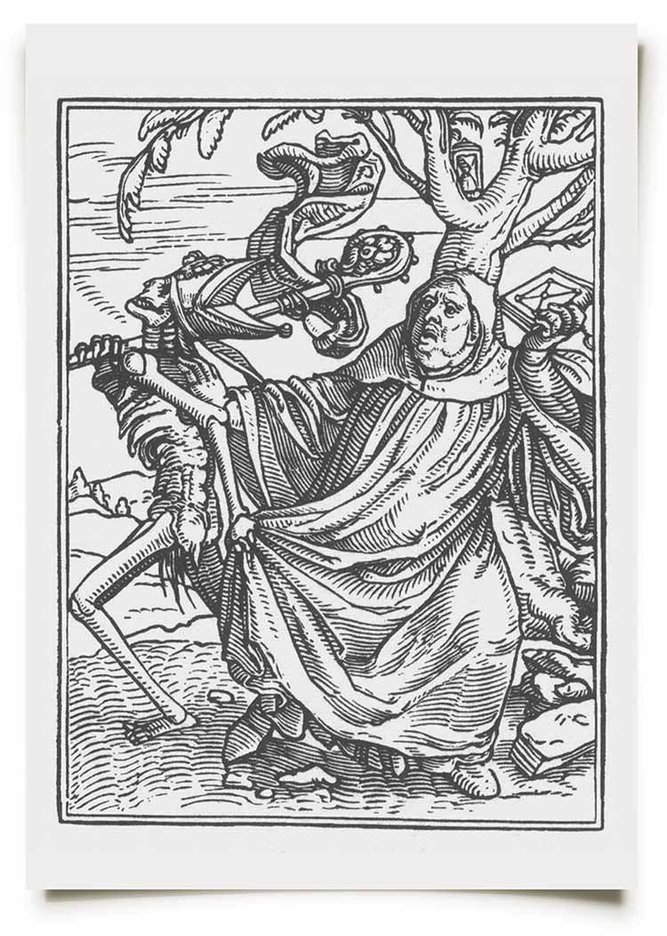
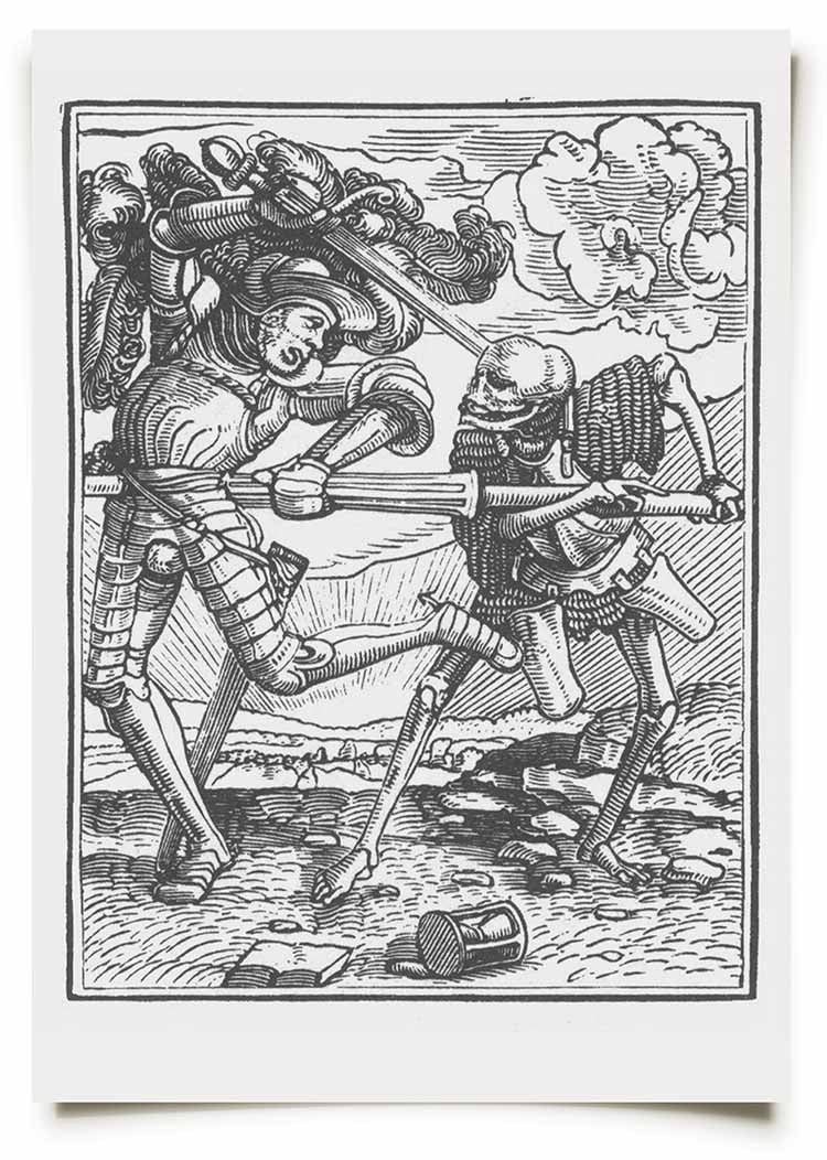


TECHNIQUE AND INFLUENCE
Wood cut printing, which was the technique used to produce these prints, relies on a drawing being transferred to a wooden block, before areas are cut away to produce a raised design. When the block has been carved or 'cut', ink is rolled onto the raised areas before the block is pressed onto a sheet of paper to make a print.
The process means that the artist who draws the initial design does not always cut their own blocks. In the case of this series, the blocks were cut by an excellent printmaker called Hans Lützelburger. It's as much the style of block cutting, as it is the designs, that interests us.
The style, in general, produces bold black lines, much like inking with a pen, and this series in particular highlights the insane amount of work that goes into producing art in this way. I absolutely love the intensity of this work and we are often asked if our work is wood cut printed. Sadly, as it's so time consuming, I've not started to get into it yet. One day I'll get the chance.
When one of us is working on a piece and we are struggling with how to approach a certain area, we usually find an old book of prints for inspiration. More often than not, the answer lays in the work of others. Over time, we have looked at so many artists that we have absorbed different styles, and now work in our own way.
Which artists do you think we should be looking at next? Let us know in the comments below.

Well, 2015 came and went and I was so busy that I barely even noticed. This was not what I had in mind for life as an adult.
When I was 15, I left school confidently declaring that I was going to paint pictures of tanks for a living. Well, it turns out that’s not actually a job, and it’s certainly not what I have spent the last four years doing. Similarly, Faye has not spent the last four years being a witch. Luckily her seven-year-old self will never find out.
As I sit here surrounded by paperwork, designs in progress, and half-full sketchbooks, I realise that we seem to have started a death art clothing brand by accident. Strange that.
Why Death Art?
As our brand grows, we often get asked how it all began. The about section of our website explains who we are and gives a little insight into how we operate, but it doesn’t quite capture the whole truth, which is that stratfordfwbchurch is the result of a long line of coincidences and unlikely opportunities.

We never sat down and decided to draw death art and neither of us planned to make skull t-shirts. It has been a long process that has lead up to this, and we’ve had insane amounts of fun along the way. Really, we’re just getting started
A Psychedelic Start: Schooling in Design
Faye and I met at art school and at the time we had wildly different styles and interests. We were never really involved in each other’s projects. I had started 2005 painting on large canvases and she was involved with performance art and bizarre little drawings. We both lacked direction, but also felt like something was brewing and that an amazing idea was just around the corner.
The real beginnings of La Mort started on the day I found an old sketchbook of mine with a pen and ink drawing in it. Until that point I had completely forgotten about the strong graphic style I used to love, and the mind blowing psychedelic poster artists that I used to try and copy.
After giving up on painting, I decided that art school wasn’t for me and spent the rest of the year designing free posters for bands, while my lecturers despaired. It was while drawing these posters that I learned traditional drafting skills, and how to ink my drawings the right way.
Skulls in Ink: Learning to Print
Our time at art school came to an end and while I spent more and more time designing posters at home, Faye went to University and, through a chance encounter with another student, was introduced to print-making. Within a few weeks, her macabre little drawings were being transformed into oily-black death prints.

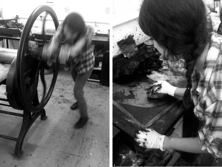
It was around this time, in 2007, that I started visiting the London Print Club in Dalston, to learn how to screen print. It seemed the next logical step if I was to take over the world with my posters. This printing process, which is still used to make all our clothing, cemented my drawing style and allowed me to focus on line work and solid black. It also became the foundation of everything we made for La Mort.
We began living with each in September 2007 and, though our drawing styles were still very different, we began to exchange ideas and swap sketches. I drifted away from the psychedelic art I had been drawing and became interested in gothic art and the posters of the Viennese Secession.
An Unlikely Collaboration
By 2009, Faye and I had rid our artwork of nearly all colour, and were almost always drawing in black and white. It would still be another year of working separately before we would come together and decide to curate a group art show. We named our partnership The Mourning Press and began producing limited runs of death prints.
Our first show, Memento Mori, opened in September 2010 and featured the work of artists whose pieces dealt, in some way, with death, decay and loss. It was the first time either of us had sold our work and it became a starting point for what was to come next. I stopped creating posters and we both settled on the idea of becoming fine art printmakers. It seemed simple enough at the time.
Our second show, The Affliction, opened in June 2011 and it was these few days that changed everything. After the opening night, we spent the rest of the week sitting at the back of the gallery drinking all the leftover wine and wondering about the public’s lack of interest in Death art. Something had to change.
While we were planning our next move, a guy walked into the gallery and started looking at our prints. He said ‘You should put these pictures on T-shirts’, and then he left.
That was the answer we were waiting for. We continued drinking wine.
Days in the cold
Our next step? Camden. For those of you that haven’t been there, Camden Market attracts some of the best (and worst) alternative and hand made art and fashion. It seemed like the best place to start. We needed a name and after many days of discussion, Faye suggested “La Mort Market”. It may have been the same day that we both decided to adopt the name for our new T-shirt label. stratfordfwbchurch was born. We spent several months printing posters and greetings cards and, for the first time, headed to Dalston to screen print our first run of T-shirts.
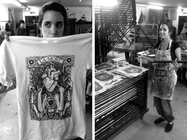
The first design we printed was called Narcosis 3 and of the 20 or 25 we printed, I think I got about 16 right. In total, we took around 40 shirts to Market on our first day and it seemed like a huge amount at the time.
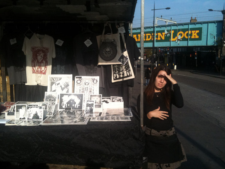
What followed was three years of our weekend market stall, where we began by selling all types of paper art and T-shirts. It was another year before we ditched the posters (they used to get wet in the rain!) and switched to clothing. A lot of you know us from Camden, and it was the most amazing start we could have wished for. We made friends and learned how to sell our work in the rain and the snow. This contact with the public really paid off when we started trading at tattoo shows.
But that’s for next time...


With our visual style borrowing heavily from Art Nouveau, psychedelic design and the darker side of Romanticism, there is one shadowy and mysterious group of writers and artists that we find fascinating. This group of men shut themselves away in a run-down hotel in Paris and regularly took part in long drug-induced reveries, with the intention of shedding some light on the effects of hashish on the intellectual mind. Their story is bizarre and incredible. All the more so as it took place in the 1840s.
Having been introduced to hashish in the Orient, sometime between 1836 and 1840, French psychiatrist Jacques-Joseph Moreau became interested in its effects and their similarity to psychosis. To further his understanding in this area, he gathered some of the leading French painters, poets and playwrights of the day with the intention of observing them while they were under the influence of the drug. It was 1844 and ‘Le Club des Hashischins’ was born.
The group would regularly gather at the Pimodan House on the Ile Saint-Louis and, once in their gothic inner sanctum, would consume quantities of dawamesk, a green paste of orange juice, herbs, spices and hashish. What followed would later inspire poet Charles Baudelaire to write ‘Le Fleurs du Mal’ and move Theophile Gautier to publish an essay ('Le Club des Hashischins’), which describes the whole fantastical scene. A few excerpts are below.
____________________
“To enter was to step two centuries back; time, which passes so fast, seemed not to have elapsed in this house, and like a clock negligently left unwound, its hands showed the same date always.
The walls, paneled in white-painted wood, were half-covered with darkened canvases that bore the stamp of the period. On a gigantic mantelpiece rose a statue that one might suppose to have been pilfered from the Versailles gardens.
On the ceiling, which arched into a dome, writhed a sprawling allegory painted with broad strokes, in the manner of Lemoine, which might have been by that painter.”
____________________
“The doctor’s face beamed with enthusiasm, his eyes sparkled his cheeks reddened, the veins in his temples stood out and his dilated nostrils drew in the air with force.
“This will be subtracted from your share in Paradise,” said he, handing me my allotted dose.
When each had eaten his portion, coffee was served in the Arab manner, that is, with the grounds and without sugar.”
____________________
“One, with a pale face in a black beard, was in peals of laughter before some unseen spectacle; another made unbelievable efforts to carry his glass to his lips, while his contortions to achieve his purpose produced a roar of jeers.
Another, in nervous agitation, twiddled his thumbs with incredible agility; yet another, thrown back in his chair, with dreamy eyes and lifeless arms, voluptuously let himself glide into the bottomless sea of oblivion.”
____________________
“The marble is gaining ground! The marble is gaining ground!”
To be sure, I could feel my limbs petrifying, and the marble enveloping me to the waist like the Tuileries’ Daphne; I was a statue halfway up, like the enchanted princes in the Arabian Nights. My hardened heels rang out formidably against the floor; I could have played the Commander in Don Giovanni.
By this time I had reached the head of the stairs, which I undertook to descend; they were half-lit, and through my dream they took on Cyclopean, gigantic proportions. Their two ends, bathed in shadow, seemed to plunge into heaven and hell, both of them abysses; raising my head, I indistinctly discerned, in a prodigious perspective, countless superposed landings, ramps leading up as to the top of the tower of Lylacq; looking down, I felt the presence of abysses of steps, whorls of spirals, dazzling circumvolutions.
This staircase must pierce the earth through and through, said I to myself as I continued my mechanical walking. I shall reach the bottom the day after Judgement Day.”
]]>
At the beginning of October 2013, we received an email asking if we would be able to produce a series of merchandise designs for a globally recognised band. That band was Rammstein and this is the first of those designs.
Initially, Faye and I set about familiarising ourselves with their existing merchandise, videos of their live performances and their lyrics. With any band project, it is usually a mix of all these things that will give us a starting point. We were given completely free reign in terms of subject matter and the final aesthetic of the design, so we just went mad with this. Gathering all of our ideas together, we settled on the concept for this first piece, before sourcing photographic reference for the animals and the open-mouthed skull. Then the real fun began.

We usually create all of our designs with no prior sketches, going straight to final artwork. This is ideal for turning work around quickly for our own clothing, but for any big client, there will be a concept/amendment/approval process before final artwork can begin. The sketches for these designs were created ¼ size and we used pencil/ballpoint pen and diluted ink to block in large areas. We tried to pack as much death in to this one piece as we could! It was a real turn around for us in terms of technique and it actually changed the way we work in general.

The words and smoke were added to the sketch after the first amendments were made. Why don’t you see if you can find out what they mean? A lot of the elements for the final piece were resized and shifted around, and detail was added at the inking stage. This was one of my favourite drawings to work on for one of my favourite clients. Wait until you see the next design!
In the 1860’s a series of Stereoscopic images was published in France that, in their own satirical style, represented life in Hell. Created by at least three different artists, these images borrowed heavily from the political goings on of the day. Scenes, depicting all manner of debauchery, were meticulously crafted in clay and then and photographed for viewing through a stereoscope.


Stereoscopic images comprise a pair of identical pictures printed side by side which, when viewed through a special viewer or stereoscope, appear to fuse together into one three dimensional image. Honestly, it’s mind-blowing!

It appears, from the gestures of the many skeletons represented in Les Diableries, that these works of art were at least partly influenced by the 1538 ‘Danse Macabre’ woodcuts by artist Hans Holbein, as well as similar prints by other artists. Both the earlier prints and the later clay models sit comfortably within a long tradition of showing Death and skeletons as comedic characters.

For further information on these ghoulish creations, there is a fantastic book entitled ‘Diableries: Stereoscopic Adventures in Hell’ by authors Brian May, Denis Pellerin and Paula Richardson Fleming. It can be found on Amazon and I highly recommend it.
]]>The show this year marked the LITC’s tenth anniversary and as always, the organisers did a fantastic job in bringing the world’s best tattoo artists and traders down to Tobacco Dock. We had a lot of help this year on the stand so I managed to get away for an hour or so to check out what was going on.
For those of you who haven’t been to this show before, it is split across two levels, with the artists working on the top floor and all of the jewellery and clothing brands etc. set up in the vaults beneath. It really is one of the best venues you could pick for a tattoo show. So, with camera in hand, I went for a wander around the upper level to see some of the artists at work. Some of the highlights are below.

I finally got to see Lal Hardy, of New Wave Tattoo, at work. He owns the longest running tattoo studio in North London. Google him.

Chris Crooks, of White Dragon Tattoo in Belfast, was also there working on a skull piece. Awesome artist. Check out his website here.

Italian artist Marco Galdo, is an absolute master at geometric dot work, and when I saw him he was working on some brave guy’s inner arm. Looked painful. Check him out here.

Alice of The Dead was there tattooing a beautiful black and red Kali on a girl’s leg. She works at Divine Canvas on Caledonian Road and you should check her out. Her website can be found here.

Some of the guys from Skin and Bone were there working the traditional way. Fantastic to see.

Got to meet up with Diana Jay, a local artist from Camden who I’ve chatted with before. She’s a wicked girl and works at East Side Tattoo Studio on Brick Lane. Go and see her!
I can’t believe we have to wait a whole year before the next show.
I have tried to credit everyone correctly. If there are any mistakes, then send us an email and I will update information.

Distilling an initial concept into a successful, clear plan for a drawing can be very difficult. It involves many thumbnail sketches and mock-ups, and we even scrap ideas for months, returning to them when we know how to make them work. This process is certainly not for the impatient. Once we have settled on a theme, and made our initial small-scale sketches, we will find reference material to help us construct the final drawing. This can be hard if we are drawing a fantastical subject. A good example of this is our drawing Youngblood. We needed reference shots for a pair of cherubs flying and fighting. After much searching, we found underwater photographs of babies swimming, that were in the right ethereal poses.
Many of our ideas don’t even make it to final designs, but the ones that do then go through a process of refining before we start gridding up the final piece.


Want more of the best art tutorials and news? Get the good stuff in your inbox. Sign up now!


Though the word gothic has become firmly attached to modern music and fashion scenes, its roots stretch back hundreds of years to a time when the themes of death and tragedy permeated literature and visual arts of the time. Romanticism, as an art movement, climaxed between the late eighteenth and the mid nineteenth century, and although very broad in the subjects that it confronted, there is a strong gothic element that Faye and I are particularly interested in. The creative work produced during this period is rich with haunting and hallucinatory images of fallen cathedrals, crowded cemeteries and bleak, spectral landscapes. Sorrow and despair had become the fashion of the day.

I know not under what fiery eye I feel my pinions breaking;
Burned by love of the beautiful I shan't have the sublime honour
Of giving my name to the abyss That will serve me as a tomb.”
The notable poets and painters of this incredible era left behind an exciting collection of material for anyone interested in the theme of death in the arts. The visionary writing of Samuel Taylor Coleridge and later, Charles Baudelaire read, in places, like hideous nightmares while the hellish landscape of opium use, described by Thomas De Quincey, heavily influenced our early drawings. Poison, love, loss and grief became well-trodden ground for a group of artists whose crushing fear of failure and defeat would drive many to madness and some to take their own lives. One artist in particular whose work exemplifies the spirit of Romanticism was the German landscape painter Casper David Freidrich. His canvases perfectly capture the lingering, oppressive feeling of melancholy and impending death with almost frightening clarity.
Though the graphic style of our work seems, at first, to share little with the work of the Romantic period, it has formed the foundation of everything we produce. The recurring motifs of decay, beauty and the grotesque have become embedded in our drawings and we owe as much to the poets and painters of the 19th century as we do to any modern graphic artists.
]]>Since meeting at art school, Faye and I have both shared a fascination with the iconography of death, as many of you will know. It is a very potent subject to approach in graphic terms, and our work often produces a profound reaction in people that happen upon it. It seems to divide opinion, causing both disgust and delight! For us, it is everything we do.
Skulls, scrolls, arrows, hearts, daggers and blood. What does it all mean and where does it come from? A visual library of iconography is like any other language, in that it is developed to communicate an idea. It can hide lust, be openly seductive or erotic, or even be used to intentionally provoke or offend. Our carefully curated collection of motifs is no different. Our drawings are produced to suggest tragedy and to restore Death to the position he held during the Renaissance. We are often asked if there are hidden messages or secret meanings within our work and, though it may appear that way, the opposite is actually true. For us, the importance of design is the power of communication within the instant. Rather than literal illustrations or allegories, we relish in creating art that explodes like a rock poster. We find the human skull the most hypnotic and important graphic symbol that is available to us. It is timeless, and, though it can be seen on any high street around the world, its true meaning is virtually beyond comprehension. It is the chilling face of absolute extinction of life. The various icons and visual tricks within each drawing hold no power of their own and must be seen as small pieces of an ongoing puzzle. Even we don't know where this is leading. All we know is that we can't stop.

The show runs from Friday 26 September to Sunday 28 September and, along with the Brighton show, is one of the events of the year for us. Get down, come and say hi to us and get some work done. See you there!
David

